
It’s been a while since I wrote the first part of this article – some of the open source software I’d based the original post on has changed significantly.
The largest change is that PhoneGap is now called Cordova. After Nitobi’s acquisition by Adobe, the name of the project was changed, and stewardship handed to the Apache Foundation. Aside from confusing the hell out of people, this doesn’t affect us much, as for our purposes the API has stayed largely the same.
The framework I had been prototyping the UI with – Ratchet – has also changed. Previously it had only supported iOS-style visuals, but with version two, the Ratchet team have rewritten the framework, decoupling the theme component to support Android and other platform specific styles.
Prototyping the UI
Let’s start by opening Terminal, and creating a new folder to keep all our code in:
mkdir book-app
cd book-app
We’re going to use Bower to manage front end dependencies. If you haven’t heard of it before, Bower is a package manager for front end libraries – in the same way that npm is used for Node.js packages. I’m assuming that you already have Bower installed, so let’s create go ahead and a bower.json file:
bower initBower will ask you a load of questions to generate the bower.json file:
[?] name: book-app
[?] version: 0.0.1
[?] description:
[?] main file:
[?] what types of modules does this package expose?
[?] keywords:
[?] authors: Nikki <your@email.com>
[?] license: MIT
[?] homepage:
[?] set currently installed components as dependencies? No
[?] add commonly ignored files to ignore list? Yes
[?] would you like to mark this package as private which prevents it from being accidentally published to the registry? YesN) y

{
  name: 'book-app',
  version: '0.0.1',
  authors: [
    'Nikki <your@email.com>'
  ],
  license: 'MIT',
  private: true,
  ignore: [
    '**/.*',
    'node_modules',
    'bower_components',
    'test',
    'tests'
  ]
}

[?] Looks good? Yes
Once the config file has been created, install Ratchet and Jasmine, remembering to save them as dependencies.
bower install ratchet jasmine --save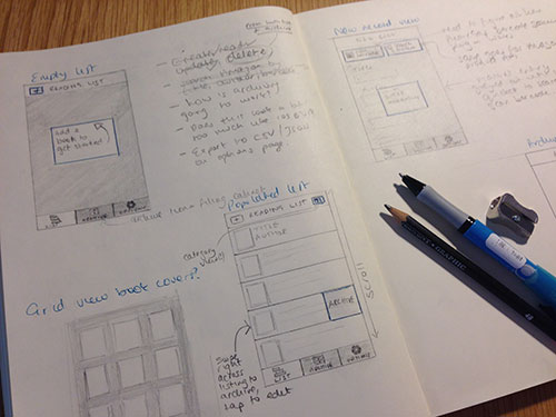
Next we’ll start creating the view. We’ve already got our sketches from the last tutorial, so with those in mind, lets flesh out the structure by writing the markup. Create a html file for each of the main three views…
touch index.html archive.html options.html…and open up the Ratchet quick start guide at the page for the basic template.
Open up the index.html file in your text editor (I use love adore Sublime Text 3) and copy the header and footer of the basic template into it. Change the CSS and JS file references to the correct ones.
<!DOCTYPE html>
<html>
  <head>
    <meta charset="utf-8">
    <title>Ratchet template page</title>

    <!-- Sets initial viewport load and disables zooming  -->
    <meta name="viewport" content="initial-scale=1, maximum-scale=1, user-scalable=no, minimal-ui">

    <!-- Makes your prototype chrome-less once bookmarked to your phone's home screen -->
    <meta name="apple-mobile-web-app-capable" content="yes">
    <meta name="apple-mobile-web-app-status-bar-style" content="black">

    <!-- Include the compiled Ratchet CSS -->
    <link rel="stylesheet" href="bower_components/ratchet/dist/css/ratchet.min.css">

    <!-- Include the compiled Ratchet JS -->
    <script src="bower_components/ratchet/dist/js/ratchet.min.js"></script>
  </head>
  <body>

...

  </body>
</html>
We also need to link to a theme, so paste the reference to the iOS theme just below the main styles:
<link rel="stylesheet" href="bower_components/ratchet/dist/css/ratchet-theme-ios.min.css">Open up Ratchet’s components documentation. In our UI sketches we designed an application bar at the top, and a navigation bar at the bottom, with a button for each of the main views. Let’s create the top bar, with a button to the right for adding new books.
<header class="bar bar-nav">
  <a class="icon icon-plus pull-right" href="#"></a>
  <h1 class="title">ReadLog Stack</h1>
</header>
The Ratchet docs say that all bars must be added before the content, so let’s create that bottom bar next:
<nav class="bar bar-tab">
  <ul class="tab-inner">
    <li class="tab-item active">
      <a href="index.html">
        <span class="icon icon-bars"></span>
        <span class="tab-label">Stack</span>
      </a>
    </li>
    <li class="tab-item">
      <a href="archive.html">
        <span class="icon icon-pages"></span>
        <span class="tab-label">Archive</span>
      </a>
    </li>
    <li class="tab-item">
      <a href="options.html">
        <span class="icon icon-gear"></span>
        <span class="tab-label">Options</span>
      </a>
    </li>
  </ul>
</nav>
And finally, we’ll create the content container:
<div class="content">
  <ul>
    <li>Books</li>
    <li>Books</li>
    <li>Books</li>
  </ul>
</div>
Copy index.html and paste the markup into archive.html and options.html. If you open this up in Chrome and enable mobile device emulation, you should see something that looks like this:

I’m going to stop here for now. In part three, I’ll be writing failing tests in Jasmine, which we’ll use to discover more of our application’s functionality. We can then develop the UI accordingly.
You can find the code for this tutorial on Github: https://github.com/nikki/ReadLog-App-Tutorial
Be sure to check back in roughly a year’s time! By then – if you’re lucky – I might have finished part three 😉