
Today we’re going to continue developing our HTML5 contact form, using CSS.
Extract the inline CSS from the head of the form and paste it into a new document. Name this new stylesheet style.css and make a reference to it in the head of the form HTML. At the top of style.css, I’ve imported Eric Meyer’s stylesheet reset (named “reset.css”) and removed the star (*) selector that temporarily reset the margin and padding. (NB: never use the start selector in production!) Your stylesheet should now look like this:
@charset "utf-8";
@import "reset.css";

form { width: 460px; padding: 20px; color: #333333; font-family: Verdana, Geneva, sans-serif; font-size: 12px; margin: 0 auto }
fieldset { border: 0; padding: 10px; margin-bottom: 10px; background: #F6F6F6 }
legend { padding: 5px 10px }
label, span { float: left; clear: left; display: block; width: 180px; padding-right: 20px; text-align: right }
input, textarea, select { float: left; width: 200px }
.submit { width: 100px; float: right; margin-right: 33px }
select { width: 206px }
p { overflow: hidden; margin-bottom: 10px }
.contact-method label { clear: none; width: auto }
.contact-method input { float: none; width: 20px }
We’re just going to make a quick couple of changes before we start.
Firstly, add ‘height: 26px; line-height: 26px’ to the ‘label, span’ selector to vertically centre the text within the input labels.
Secondly, there’s a bit of a bug in IE concerning legends and fieldsets – IE bleeds the background colour of the fieldset behind the legend. To recify this, we’re going to add a little bit more margin to the bottom of the fieldset, and position the legend absolutely within it.
Unfortunately, positioning the legends absolutely within a fieldset that has padding triggers a bug in Firefox. This bug causes Firefox to calculate the legend’s position incorrectly, so to fix this, we’re going to remove the padding from the top of the fieldset, and add that padding to the first paragraph in the fieldset instead. Add “padding-top: 0” to the fieldset attribute, and “p:first-of-type { padding-top: 25px }” underneath the fieldset style. I rarely see :first-of-type used out in the wild, as :first-child can often be used in a similar context. However, :first-of-type selects the element that is the first sibling of that type within it’s parent, rather than just selecting the first child. Very useful!
Now that we’ve fixed that, we’ve broken IE again by removing the padding. Add the hack “padding-top: 25px9” to the fieldset selector and we should be good to go.
With these changes, your css should look like this:
form { width: 460px; padding: 20px; color: #333333; font-family: Verdana, Geneva, sans-serif; font-size: 12px; margin: 0 auto }
fieldset { position: relative; padding: 10px; padding-top: 0; padding-top: 25px9; margin-bottom: 30px; background: #F6F6F6 }
legend { padding: 6px 12px; position: absolute; left: 10px; top: -11px }
label, span { float: left; clear: left; display: block; width: 180px; padding-right: 20px; text-align: right; height: 26px; line-height: 26px }
input, textarea, select { float: left; width: 200px }
.submit { width: 100px; float: right; margin-right: 33px }
select { width: 206px }
p { overflow: hidden; margin-bottom: 10px }
p:first-of-type { padding-top: 25px }
.contact-method label { clear: none; width: auto }
.contact-method input { float: none; width: 20px }
Now that we have a base template for our form, we can start adding styles.
Border Radius
We’re going to add a rounded corner to the fieldsets, legends and submit button, add background and text colours to the legends, and change the style of the submit button. At the moment, we still have to use vendor prefixes for border-radius, so this style declaration usually consists of three lines:
#style {
    -webkit-border-radius: <value>;
    -moz-border-radius: <value>;
    border-radius: <value>;
}
Edit your css using the styles highlighted below.
form { width: 460px; padding: 20px; color: #333333; font-family: Verdana, Geneva, sans-serif; font-size: 12px; margin: 0 auto }
fieldset { position: relative; padding: 10px; padding-top: 0; padding-top: 25px9; margin-bottom: 30px; background: #F6F6F6; -webkit-border-radius: 8px; -moz-border-radius: 8px; border-radius: 8px }
legend { padding: 5px 10px; background-color: #4F709F; color: white; -webkit-border-radius: 4px; -moz-border-radius: 4px; border-radius: 4px }
label, span { float: left; clear: left; display: block; width: 180px; padding-right: 20px; text-align: right; height: 26px; line-height: 26px }
input, textarea, select { float: left; width: 200px }
.submit { width: 100px; float: right; margin-right: 38px; border: 0; padding: 5px 10px; background: #4F709F; color: white; -webkit-border-radius: 4px; -moz-border-radius: 4px; border-radius: 4px }
select { width: 202px }
p { overflow: hidden; margin-bottom: 10px }
p:first-of-type { padding-top: 25px }
.contact-method label { clear: none; width: auto }
.contact-method input { float: none; width: 20px }
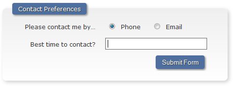
The last fieldset on the form should look like this:

I think it’s easy to go overboard with border-radius, so we’ll leave that bit there for now. Next up, background gradients.
Background Gradients
We have to use vendor prefixes to enable this to work in Firefox and Webkit. Unlike border radius, each vendor uses a different syntax for their style declaration, so it can be a little confusing. There are more properties associated with setting a background gradient style, but I’ve listed the most common ones below.
Firefox has linear gradient and radial gradient values…
#style {
    background-image: -moz-linear-gradient( [<point> || <angle>,]? <stop>, <stop> [, <stop>]* );
    background-image: -moz-radial-gradient( [<position> || <angle>,]? [<shape> || <size>,]? <stop>, <stop>[, <stop>]* )
}
…whereas Webkit allows you to specify whether the gradient is a linear or radial one within “-webkit-gradient”:
#style {
    background-image: -webkit-gradient(<type>, <point> [, <radius>]?, <point> [, <radius>]? [, <stop>]*)
}
Note that you can also specify these gradients within the “background” shorthand property.
For our form, we’ll be using a grey border on the input boxes, and a slight gradient on the fieldsets.
form { width: 460px; padding: 20px; color: #333333; font-family: Verdana, Geneva, sans-serif; font-size: 12px; margin: 0 auto }
fieldset { position: relative; padding: 10px; padding-top: 0; padding-top: 25px9; margin-bottom: 30px; background: #F6F6F6; -webkit-border-radius: 8px; -moz-border-radius: 8px; border-radius: 8px; background: -webkit-gradient(linear, left top, left bottom, from(#EEEEEE), to(#FFFFFF)); background: -moz-linear-gradient(center top, #EFEFEF, #FFFFFF 100%) }
legend { padding: 6px 12px; position: absolute; left: 10px; top: -36px; background-color: #4F709F; color: white; -webkit-border-radius: 4px; -moz-border-radius: 4px; border-radius: 4px }
label, span { float: left; clear: left; display: block; width: 180px; padding-right: 20px; text-align: right; height: 26px; line-height: 26px }
input, textarea, select { float: left; width: 200px; border: 1px solid #d9d9d9 }
.submit { width: 100px; float: right; margin-right: 37px; border: 0; padding: 5px 10px; background: #4F709F; color: white; -webkit-border-radius: 4px; -moz-border-radius: 4px; border-radius: 4px }
textarea { background: -webkit-gradient(linear, left top, left bottom, from(#FFFFFF), color-stop(1%, #EEEEEE), to(#FFFFFF)) }
select { width: 202px }
p { overflow: hidden; margin-bottom: 10px }
p:first-of-type { padding-top: 25px }
.contact-method label { clear: none; width: auto }
.contact-method input { float: none; width: 20px }
After these styles have been added, you should see something that looks like the image below.

Next we’re going to add a drop shadow to make the bottom corners of the fieldsets a little more prominent.
Box Shadow
Box shadow is similar to border-radius syntax-wise, you need to specify two vendor prefix properties and the official property as defined in the CSS3 spec. Border-radius takes 3 lengths: the horizontal offset, the vertical offset, and the blur radius; and a colour.
#style {
    -webkit-box-shadow: <horz>, <vert>, <blur>, <color>;
    -moz-box-shadow: <horz>, <vert>, <blur>, <color>;
    box-shadow: <horz>, <vert>, <blur>, <color>;
}
We’re going to add a box shadow to the fieldsets, the legends, and the submit button, using the values highlighted below. Notice that we’re also adding 4px margin to prevent the overflow: auto property on the parent paragraph tag from clipping the shadow on the bottom of the submit button.
form { width: 460px; padding: 20px; color: #333333; font-family: Verdana, Geneva, sans-serif; font-size: 12px; margin: 0 auto }
fieldset { position: relative; padding: 10px; padding-top: 0; padding-top: 25px9; margin-bottom: 30px; background: #F6F6F6; -webkit-border-radius: 8px; -moz-border-radius: 8px; border-radius: 8px; background: -webkit-gradient(linear, left top, left bottom, from(#EFEFEF), to(#FFFFFF)); background: -moz-linear-gradient(center top, #EFEFEF, #FFFFFF 100%); box-shadow: 3px 3px 10px #ccc; -moz-box-shadow: 3px 3px 10px #ccc; -webkit-box-shadow: 3px 3px 10px #ccc }
legend { padding: 6px 12px; position: absolute; left: 10px; top: -11px; background-color: #4F709F; color: white; -webkit-border-radius: 4px; -moz-border-radius: 4px; border-radius: 4px; box-shadow: 2px 2px 4px #888; -moz-box-shadow: 2px 2px 4px #888; -webkit-box-shadow: 2px 2px 4px #888 }
label, span { float: left; clear: left; display: block; width: 180px; padding-right: 20px; text-align: right; height: 26px; line-height: 26px }
input, textarea, select { float: left; width: 200px; border: 1px solid #d9d9d9 }
.submit { width: 100px; float: right; margin-right: 37px; border: 0; padding: 5px 10px; background: #4F709F; color: white; -webkit-border-radius: 4px; -moz-border-radius: 4px; border-radius: 4px; box-shadow: 2px 2px 4px #888; -moz-box-shadow: 2px 2px 4px #888; -webkit-box-shadow: 2px 2px 4px #888; margin-bottom: 4px }
textarea { background: -webkit-gradient(linear, left top, left bottom, from(#FFFFFF), color-stop(1%, #EEEEEE), to(#FFFFFF)) }
select { width: 202px }
p { overflow: hidden; margin-bottom: 10px }
p:first-of-type { padding-top: 25px }
.contact-method label { clear: none; width: auto }
.contact-method input { float: none; width: 20px }

Very Useful Tip: You can also use rgba values with box shadow, achieving an effect similar to the one I described in my CSS3 Alpha Transparent Gradients post.
Text Shadow
Next we’ll add a bit of text shadow on the legends and submit button to make them stand out a little more. The text shadow property is pretty much the same as box shadow. It takes 3 values and a colour, that is, the x value of the shadow, the y value of the shadow, the blur radius, and a colour. However, this time we don’t have to use vendor prefixes, as native property is supported in all current browsers.
#style {
    text-shadow: <horz>, <vert>, <blur>, <color>;
}
Add the highlighted lines below to your css.
form { width: 460px; padding: 20px; color: #333333; font-family: Verdana, Geneva, sans-serif; font-size: 12px; margin: 0 auto }
fieldset { position: relative; padding: 10px; padding-top: 0; padding-top: 25px9; margin-bottom: 30px; background: #F6F6F6; -webkit-border-radius: 8px; -moz-border-radius: 8px; border-radius: 8px; background: -webkit-gradient(linear, left top, left bottom, from(#EFEFEF), to(#FFFFFF)); background: -moz-linear-gradient(center top, #EFEFEF, #FFFFFF 100%); box-shadow: 3px 3px 10px #ccc; -moz-box-shadow: 3px 3px 10px #ccc; -webkit-box-shadow: 3px 3px 10px #ccc }
legend { padding: 6px 12px; position: absolute; left: 10px; top: -11px; background-color: #4F709F; color: white; -webkit-border-radius: 4px; -moz-border-radius: 4px; border-radius: 4px; box-shadow: 2px 2px 4px #888; -moz-box-shadow: 2px 2px 4px #888; -webkit-box-shadow: 2px 2px 4px #888; text-shadow: 1px 1px 1px #333 }
label, span { float: left; clear: left; display: block; width: 180px; padding-right: 20px; text-align: right; height: 26px; line-height: 26px }
input, textarea, select { float: left; width: 200px; border: 1px solid #d9d9d9 }
.submit { width: 100px; float: right; margin-right: 37px; border: 0; padding: 5px 10px; background: #4F709F; color: white; -webkit-border-radius: 4px; -moz-border-radius: 4px; border-radius: 4px; box-shadow: 2px 2px 4px #888; -moz-box-shadow: 2px 2px 4px #888; -webkit-box-shadow: 2px 2px 4px #888; margin-bottom: 4px; text-shadow: 1px 1px 1px #333 }
textarea { background: -webkit-gradient(linear, left top, left bottom, from(#FFFFFF), color-stop(1%, #EEEEEE), to(#FFFFFF)) }
input:focus, textarea:focus, select:focus { background: white; border-color: #666 }
select { width: 202px }
p { overflow: hidden; margin-bottom: 10px }
p:first-of-type { padding-top: 25px }
.contact-method label { clear: none; width: auto }
.contact-method input { float: none; width: 20px }

Focus Highlighting
We’re going to add one last style, to make the input boxes more prominent when they’re in focus…
nput:focus, textarea:focus, select:focus { border-color: #666 }…and one last tweak, to make the input boxes a little bigger.
input, textarea, select { padding: 3px; float: left; width: 200px; border: 1px solid #d9d9d9 }
select { width: 208px }

The final CSS should look like this:
form { width: 460px; padding: 20px; color: #333333; font-family: Verdana, Geneva, sans-serif; font-size: 12px; margin: 0 auto }
fieldset { position: relative; padding: 10px; padding-top: 0; margin-bottom: 30px; background: #F6F6F6; -webkit-border-radius: 8px; -moz-border-radius: 8px; border-radius: 8px; background: -webkit-gradient(linear, left top, left bottom, from(#EFEFEF), to(#FFFFFF)); background: -moz-linear-gradient(center top, #EFEFEF, #FFFFFF 100%); box-shadow: 3px 3px 10px #ccc; -moz-box-shadow: 3px 3px 10px #ccc; -webkit-box-shadow: 3px 3px 10px #ccc }
legend { padding: 6px 12px; position: absolute; left: 10px; top: -11px; background-color: #4F709F; color: white; -webkit-border-radius: 4px; -moz-border-radius: 4px; border-radius: 4px; box-shadow: 2px 2px 4px #888; -moz-box-shadow: 2px 2px 4px #888; -webkit-box-shadow: 2px 2px 4px #888; text-shadow: 1px 1px 1px #333 }
label, span { float: left; clear: left; display: block; width: 180px; padding-right: 20px; text-align: right; height: 26px; line-height: 26px }
input, textarea, select { padding: 3px; float: left; width: 200px; border: 1px solid #d9d9d9 }
.submit { width: 100px; float: right; margin-right: 37px; border: 0; padding: 5px 10px; background: #4F709F; color: white; -webkit-border-radius: 4px; -moz-border-radius: 4px; border-radius: 4px; box-shadow: 2px 2px 4px #888; -moz-box-shadow: 2px 2px 4px #888; -webkit-box-shadow: 2px 2px 4px #888; margin-bottom: 4px; text-shadow: 1px 1px 1px #333 }
textarea { background: -webkit-gradient(linear, left top, left bottom, from(#FFFFFF), color-stop(1%, #EEEEEE), to(#FFFFFF)) }
input:focus, textarea:focus, select:focus { background: white; border-color: #666 }
select { width: 208px }
p { overflow: hidden; margin-bottom: 10px }
p:first-of-type { padding-top: 25px }
.contact-method label { clear: none; width: auto }
.contact-method input { float: none; width: 20px }
In the next tutorial, I’ll show you how to test for browser support of the new input types.